Hello, I’m Tim.

I work as the VP of Product and Media Design at a fintech called BAFS while living in the Boise metro area. As a 20-year design veteran with 10 years of recent UX work, my focus is leading processes that learn from people, synthesize insights, and craft user-centered experiences. Learn more from my resume.
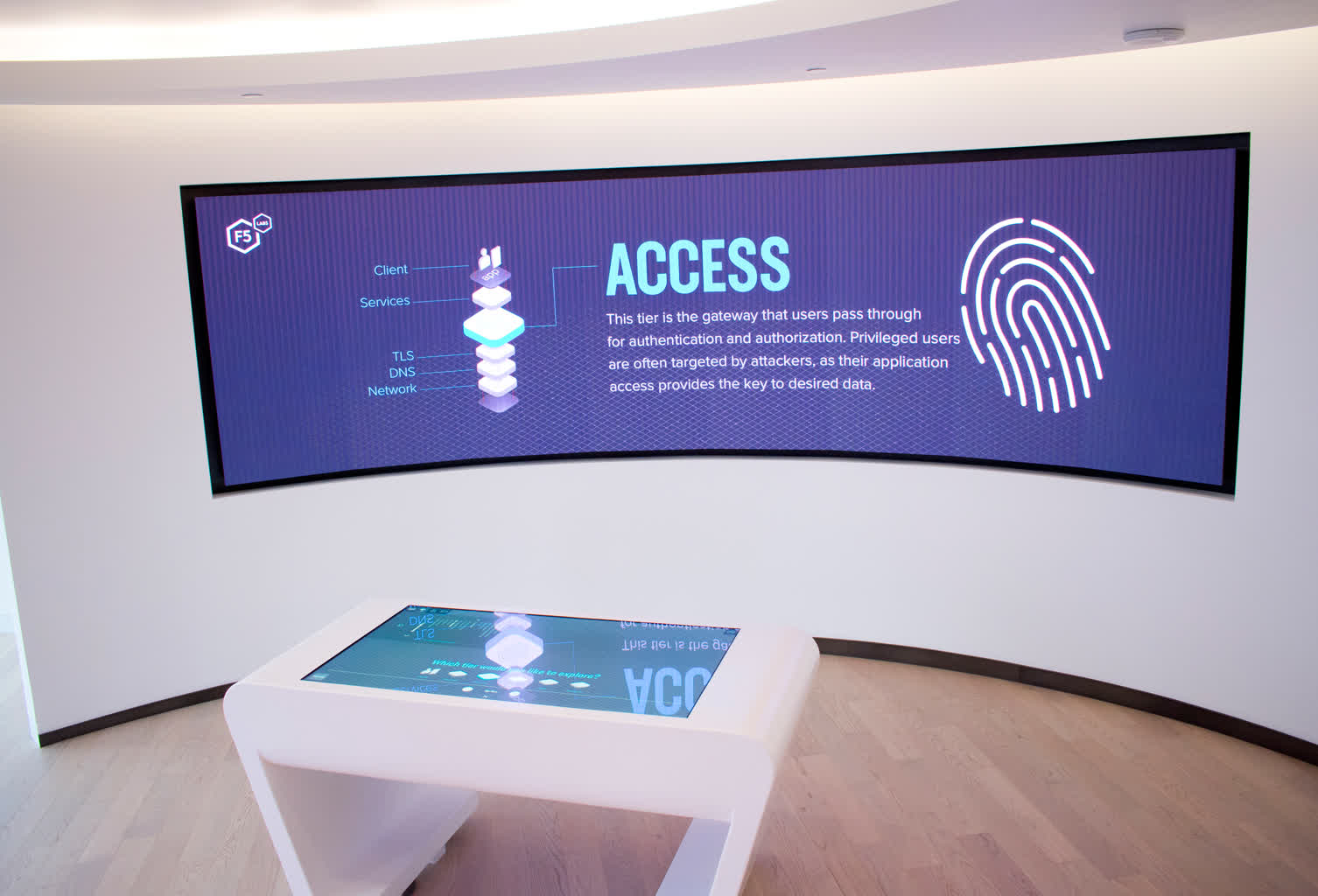
F5 Networks
The F5 Networks Customer Engagement Center is located on the 48th floor of the F5 Tower in Seattle. Our team designed and produced two interactive platforms to enhance their customer experience and elevate the F5 brand.
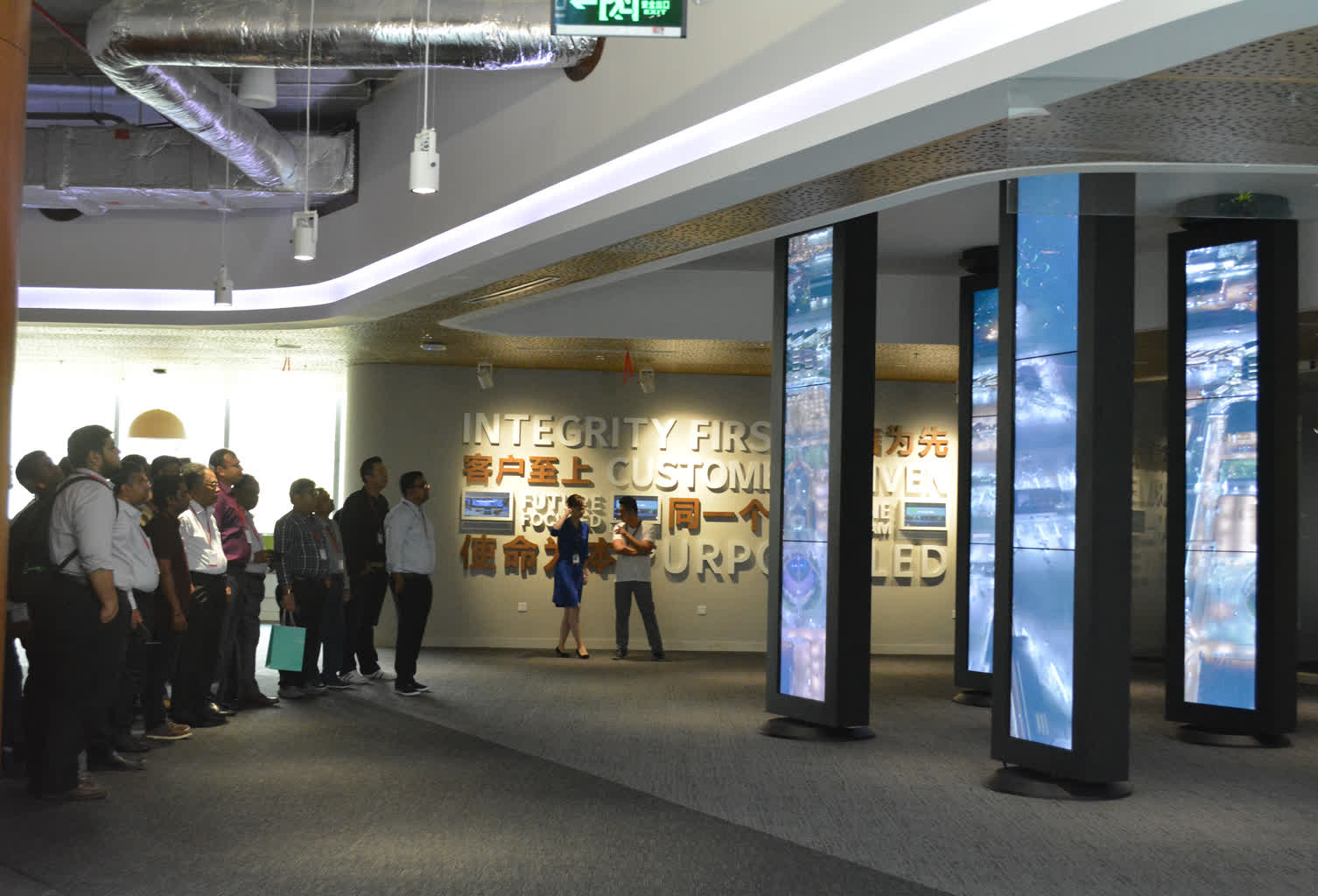
Johnson Controls Shanghai
A series of touchpoints to engage customers and connect them with the JCI brand. Immersive storytelling convey innovations, values, thought leadership, history, and solutions.
BMC EBC
One app in nine spaces had to welcome, inform, explore, discover, collaborate, ideate, and present.
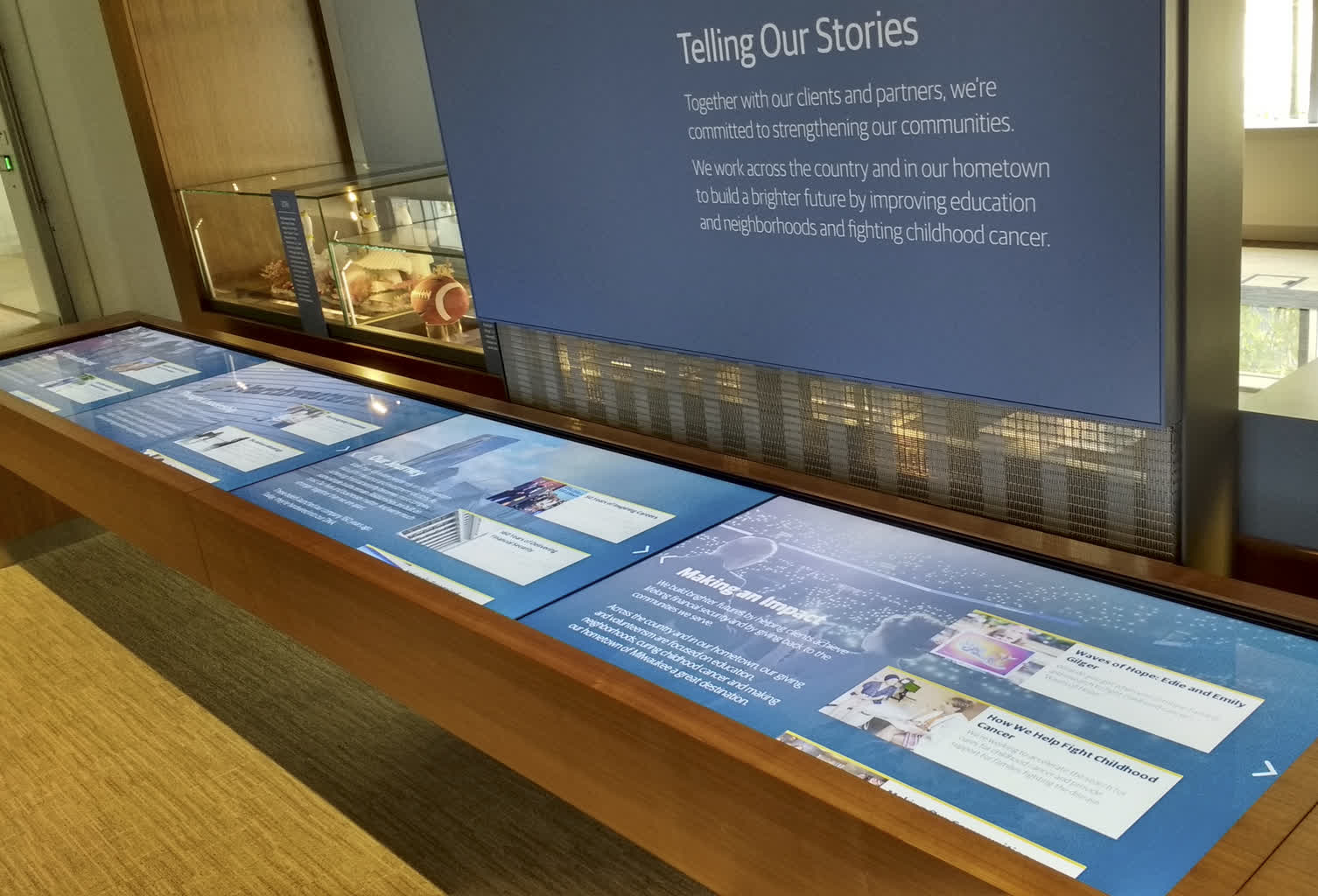
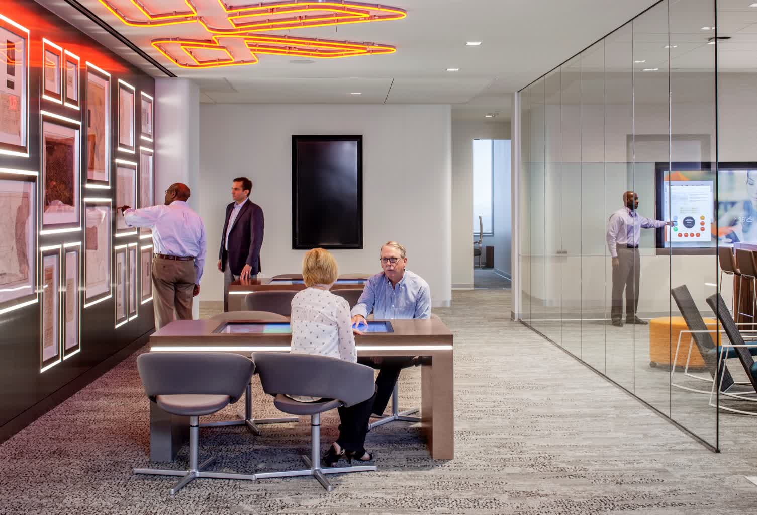
Northwestern Mutual
Our team iterated with the customer on the user interactions and content experience to evolve and implement the platforms.
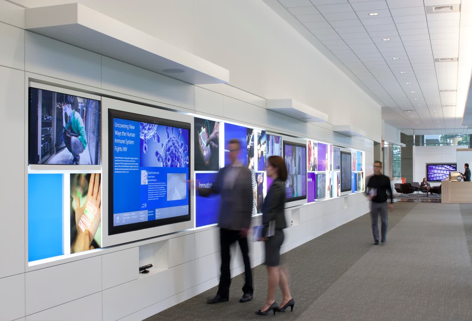
Microsoft EBC
Visually communicate the four part journey customers take through the space and articulate key tasks in each space.
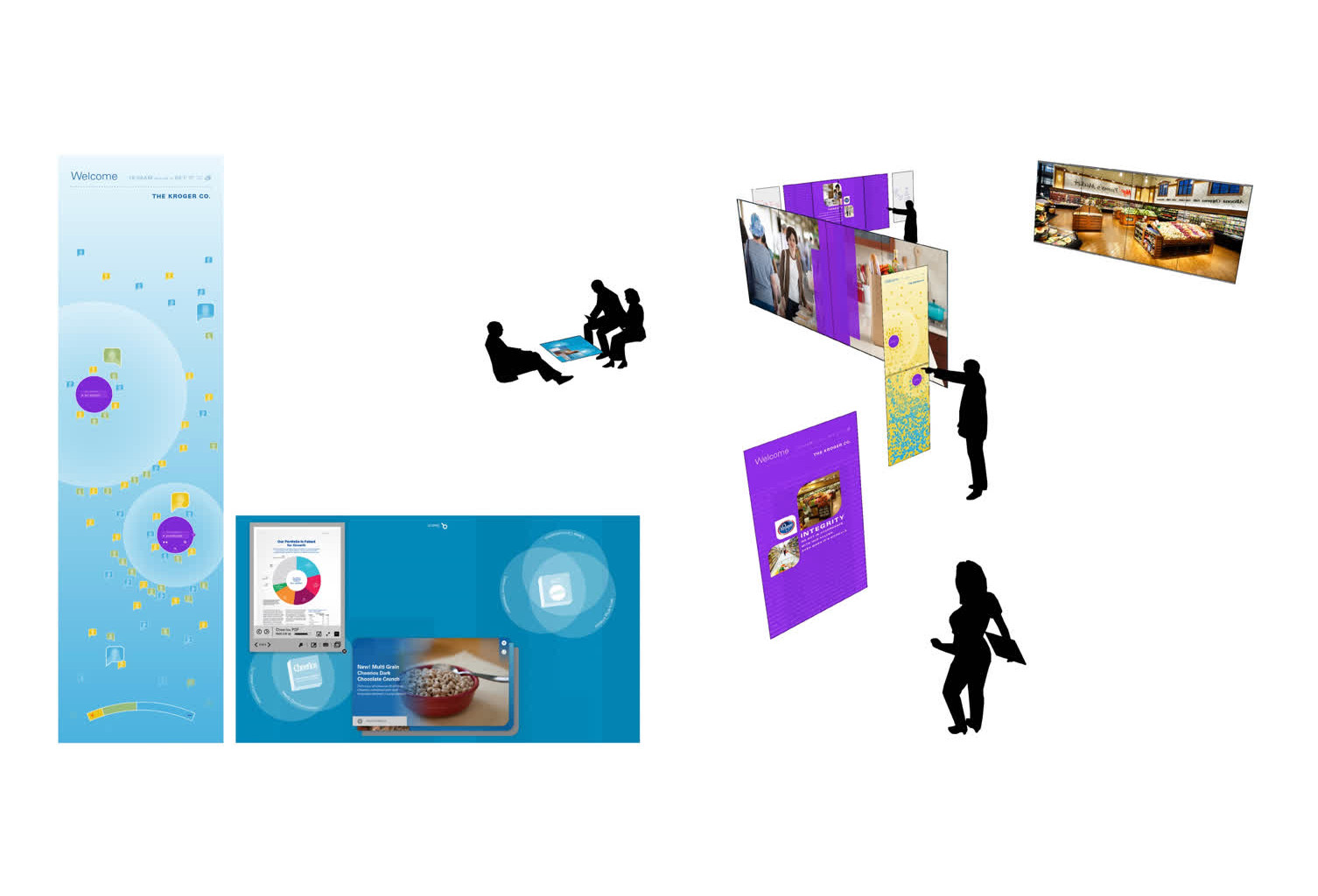
General Mills
With the center table surrounded by two 18 foot projection displays and one 10 foot touch wall, the immersive content experience supports the story.
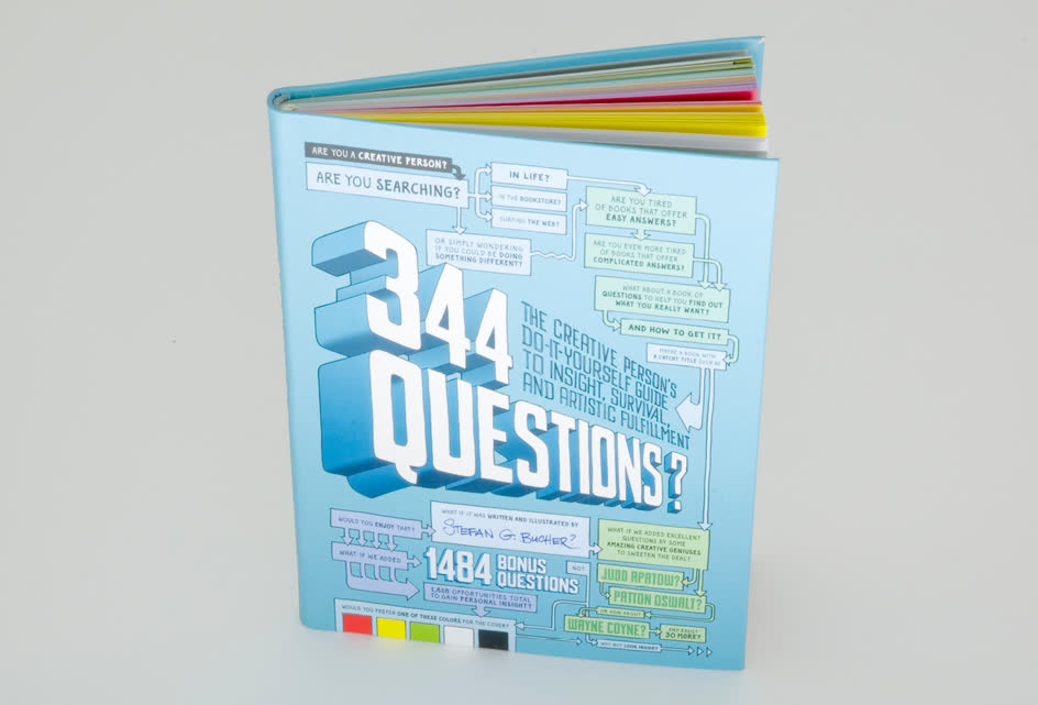
344 Questions
In the spring of 2011 Stefan asked me to assist him with a book project called, 344 Questions, The Creative Person’s Do-It-Yourself Guide to Insight, Survival, and Artistic Fulfillment.
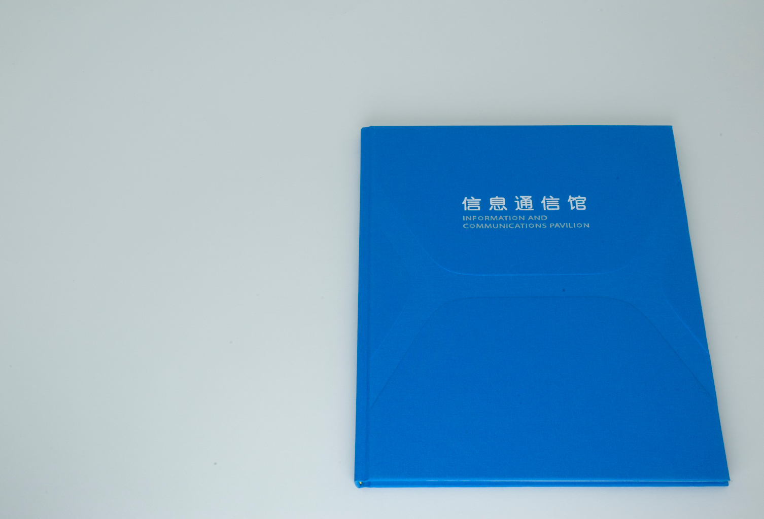
Information and Communications Pavilion Book
Just weeks after the close of Expo 2010 Shanghai, China, BRC Imagination Arts hired me to design and produce a book to showcase the extensive portfolio of work produced for the Information and Communications Pavilion.
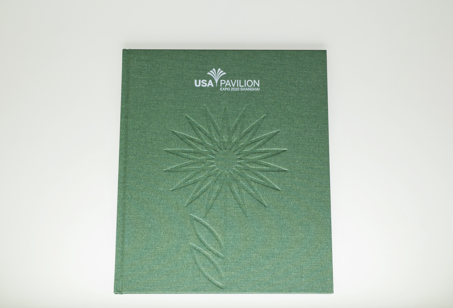
USA Pavilion Book
BRC Imagination Arts asked me to design and produce a book to tell the story of their involvement with the USA Pavilion at Expo 2010 Shanghai, China.
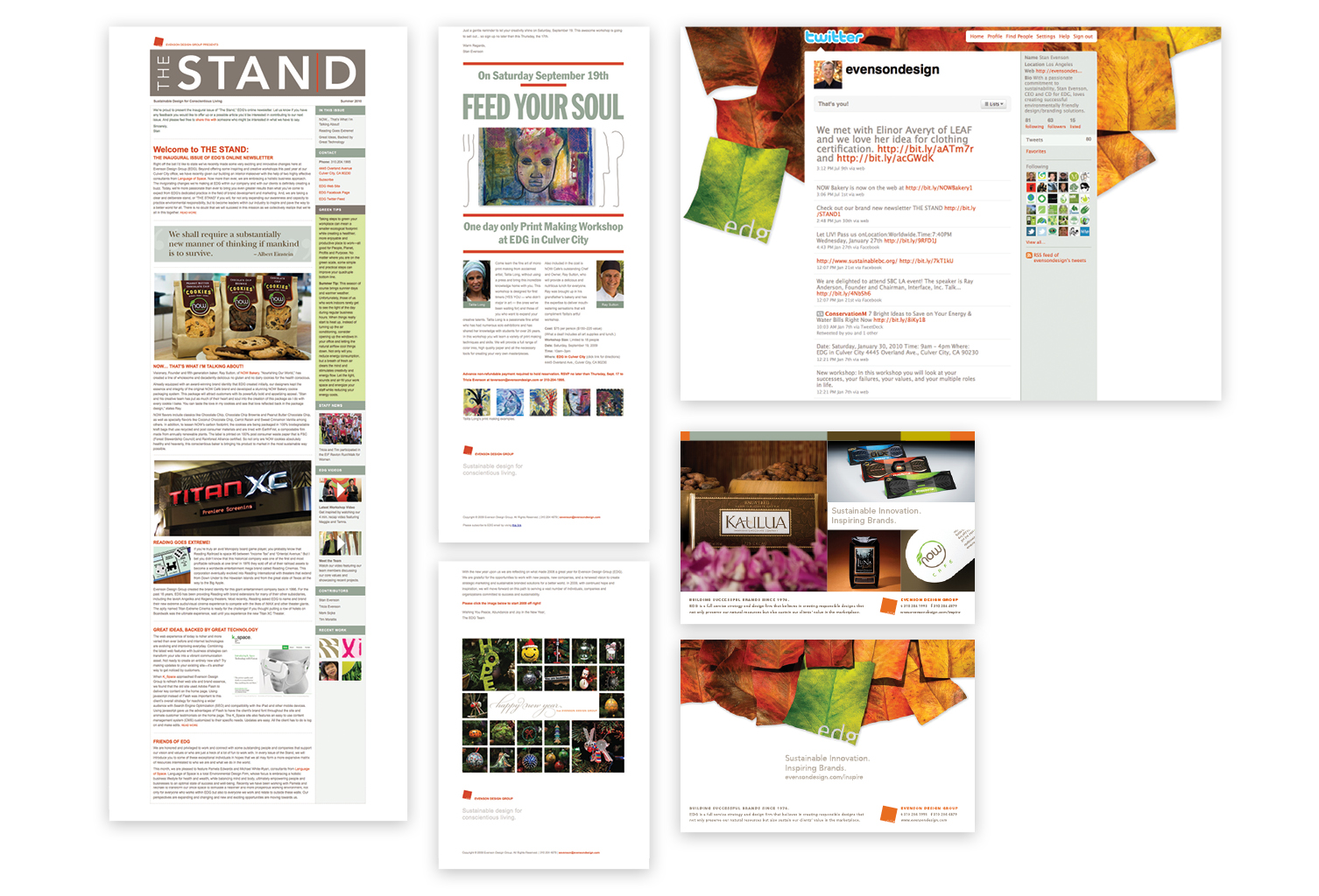
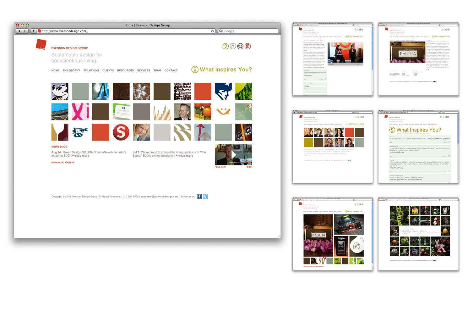
Evenson Design Group Marketing
Over a two year period, our office produced over 20 HTML email campaigns to promote our business to our contacts.